Website design and technology are constantly evolving and evolving, and it’s more important now than ever to stay informed on what makes a website successful. To amp up your UX strategy, Here are some common UI design mistakes that we’ve encountered over
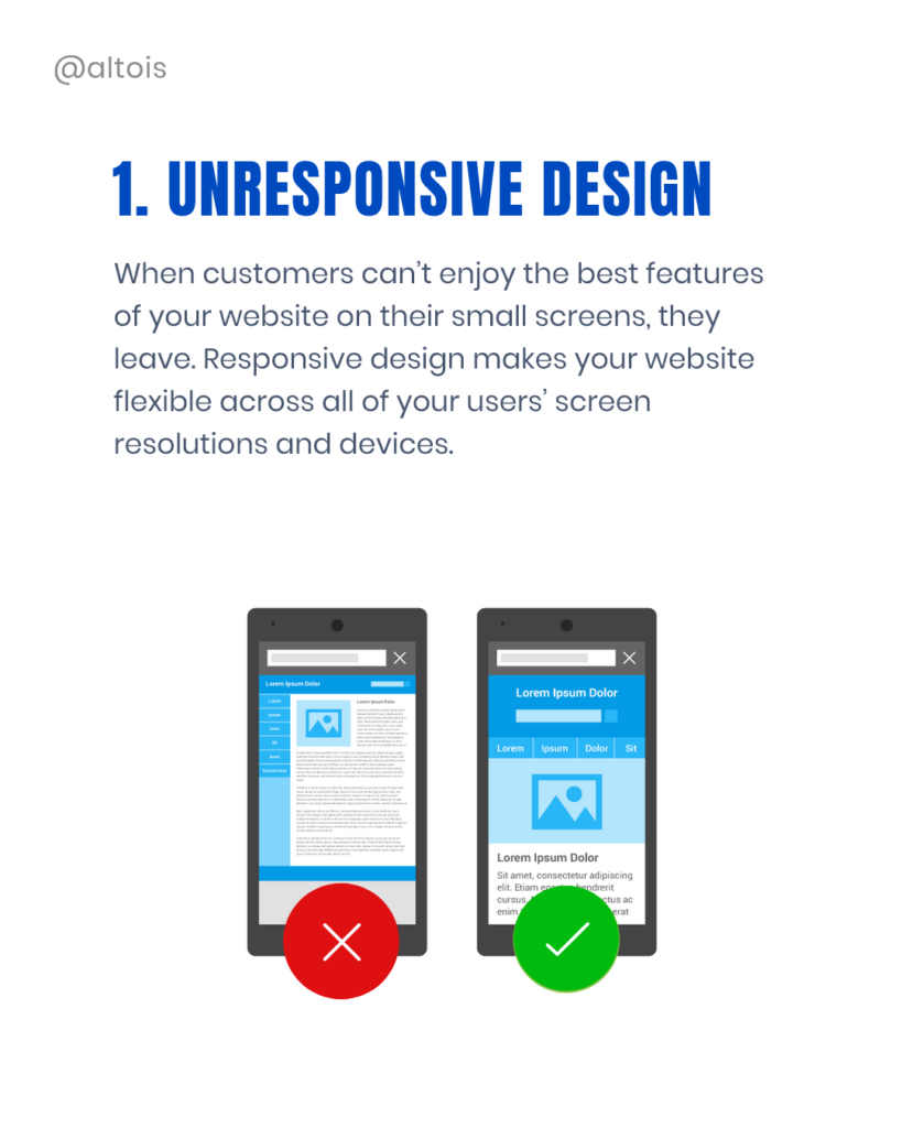
Unresponsive Design
An unresponsive design prevents you from providing the best UX experience possible. That makes the design complicated and can set off your user from the website.
Reports say that mobile internet has surpassed desktop. This means that your website should be accessible and responsive to any device.
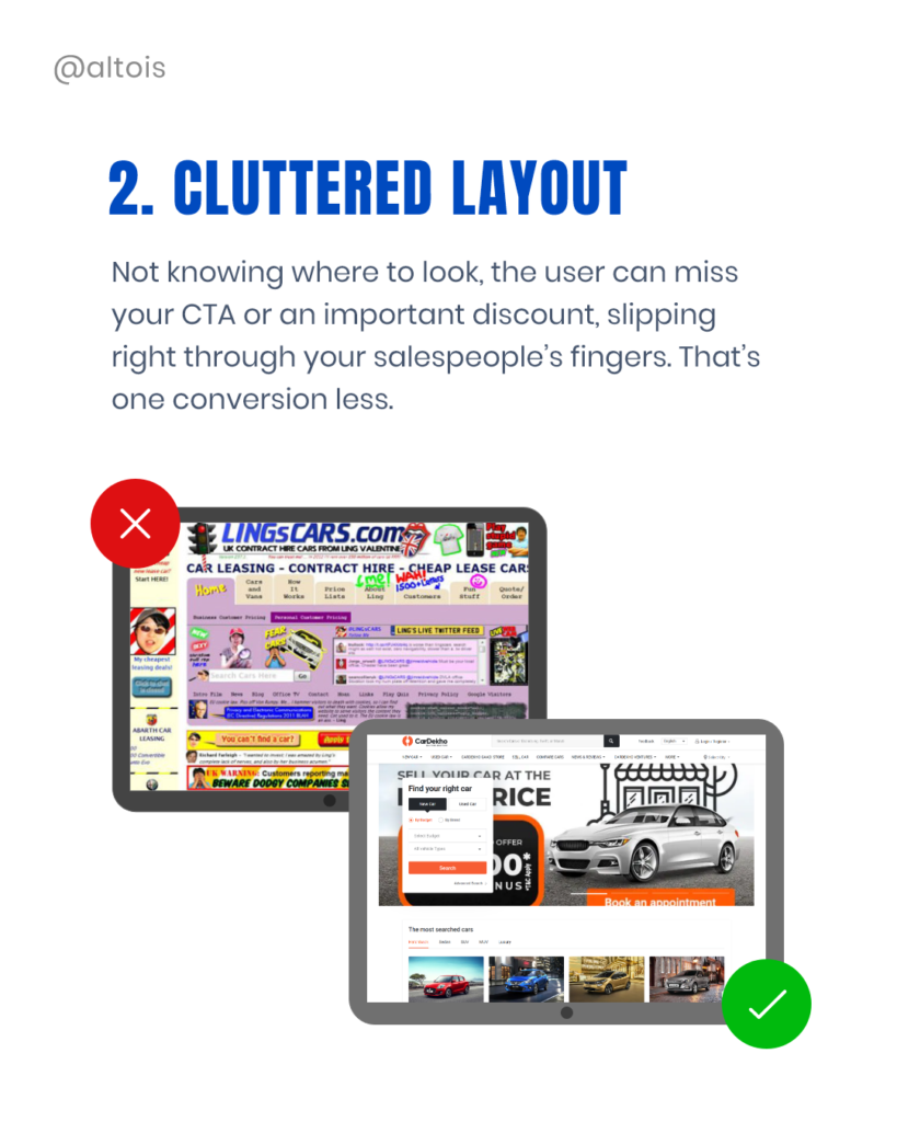
Cluttered Layout
Lots of descriptive text is outdated—the shorter and simpler, the website the much better the user experience. Organizations are slowly upgrading to long scrolling homepages with simple navigations.
Unintuitive Navigation
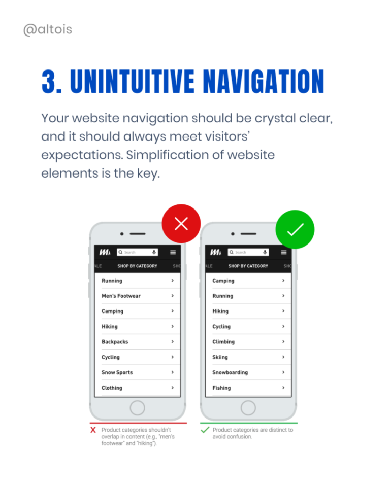
Your website navigation should be clear and simple to navigate. That means it should have a hierarchy that is easy to follow.
Since you only have a second or two to convince your visitors to stay, a user-friendly navigation key is essential.
Uninviting CTAs
CTA’s are part of the landing page that the user needs to click in order to take action. CTA buttons can vary in shape and size depending on your goal.
The CTA button should stand out from the background and create a sense of urgency.

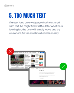
Too Much Text
The study says that users engage much more with creatives. If you have too much text on the website, no one will read its entire sentences and paragraphs. This results in users abandoning your website.
Design is a constant process and requires continuous work to improve. But by understanding the most common UI design Mistakes, you’re more likely to design a product that will meet users’ expectations.
Struggling with UI design Mistakes? Get in Touch with us and we will take care of it.
Altois has been recognized as one of the TOP UK Digital Agencies by DesignRush.


